Tabali is a pillar of Egyptian authentic cuisine. The brand had a loyal following across 20+ branches, a retail line, and a generation of customers who grew up eating there.
The brief was delicate: refresh the visual language so it could speak to a younger, trend-aware audience — but don't touch what made the brand beloved in the first place.
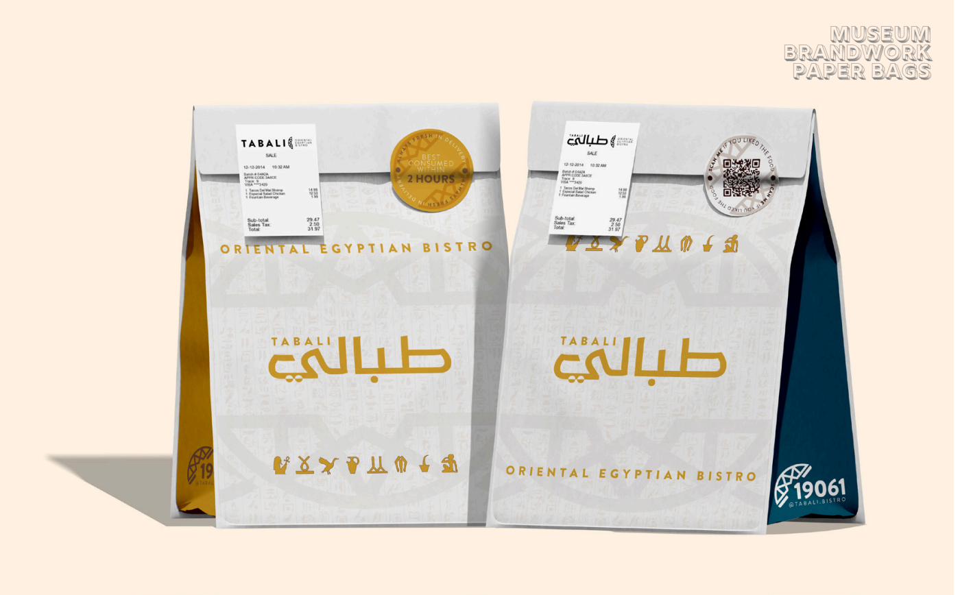
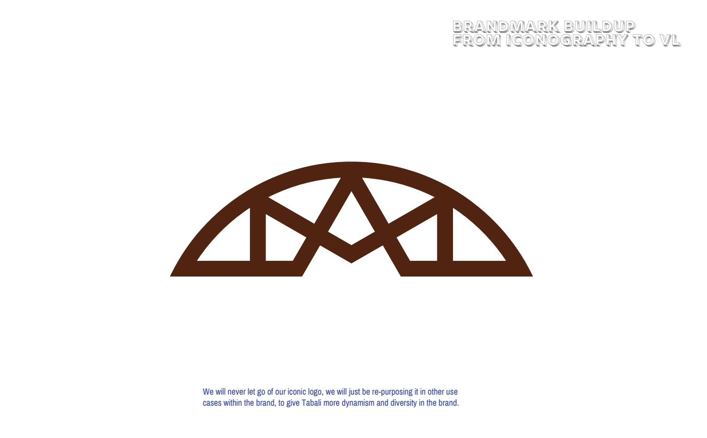
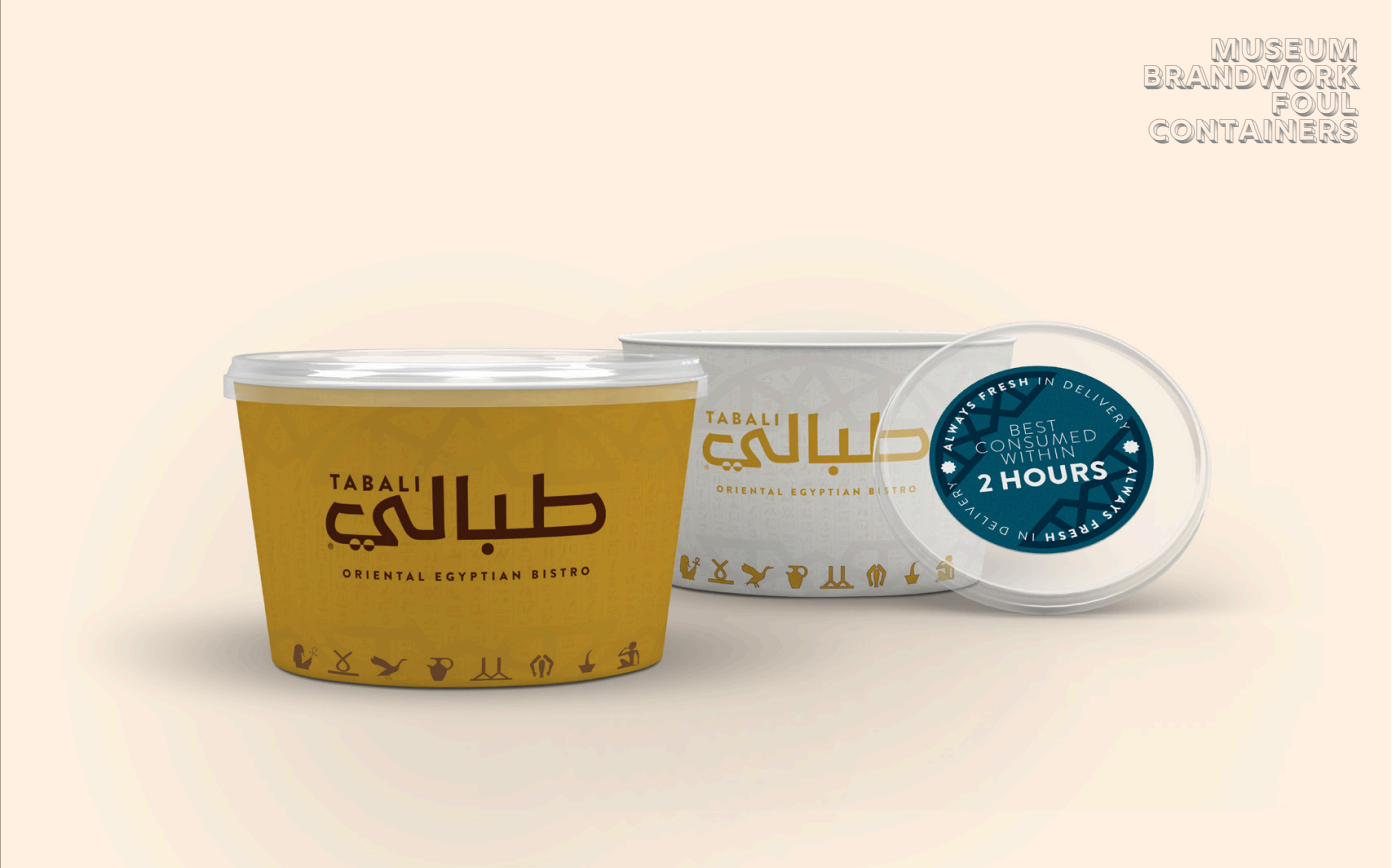
We ran a visual equity analysis on every asset: what stays, what evolves, what gets revolutionized, what gets flushed. The iconic logo stayed. The English font style, the redundancy, the stale iconography — those got repurposed or cut.
We went with a minimal hieroglyphics direction — Egyptian enough to feel native, restrained enough not to feel like a theme park. The brandmark evolved from iconography to visual language, giving Tabali more dynamism across touchpoints without losing its core.
My role was coordinating the external agencies and designers, reviewing every deliverable, and ensuring the rollout stayed consistent across 20+ branches — from signage to packaging to digital. I also coordinated the parallel launch of a subsidiary brand within the group.
Tabali is a pillar of Egyptian authentic cuisine — and this brand represents us as Egyptians.— Rebrand brief